STV Asset Management
Role: Lead Designer
Team: Product Manager, Software Engineers, Developers, Data Scientist
Tags: UX Design, UI Design, Product Design
Problem
Organizations lacked clear visibility into how limited budgets impact asset performance over time. Existing tools were complex, fragmented, and required manual analysis, making long-term planning difficult.
Objective
Design a web application that helps organizations forecast budgets, track assets, and make informed decisions that helps users:
Forecast costs over time
Prioritize maintenance and investments
Make faster, data-informed decisions
Solution
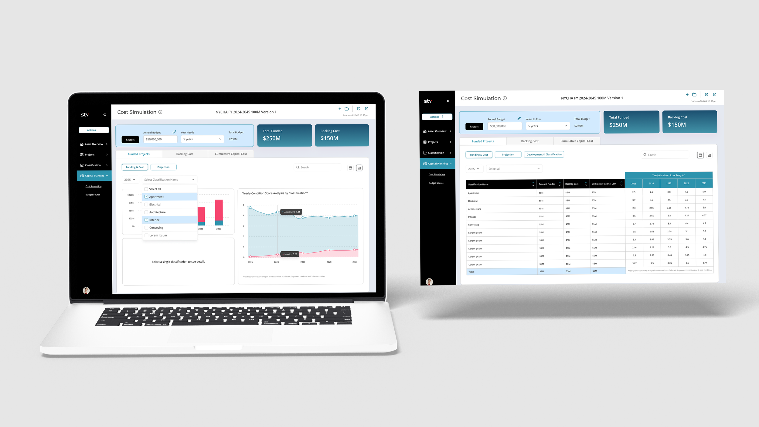
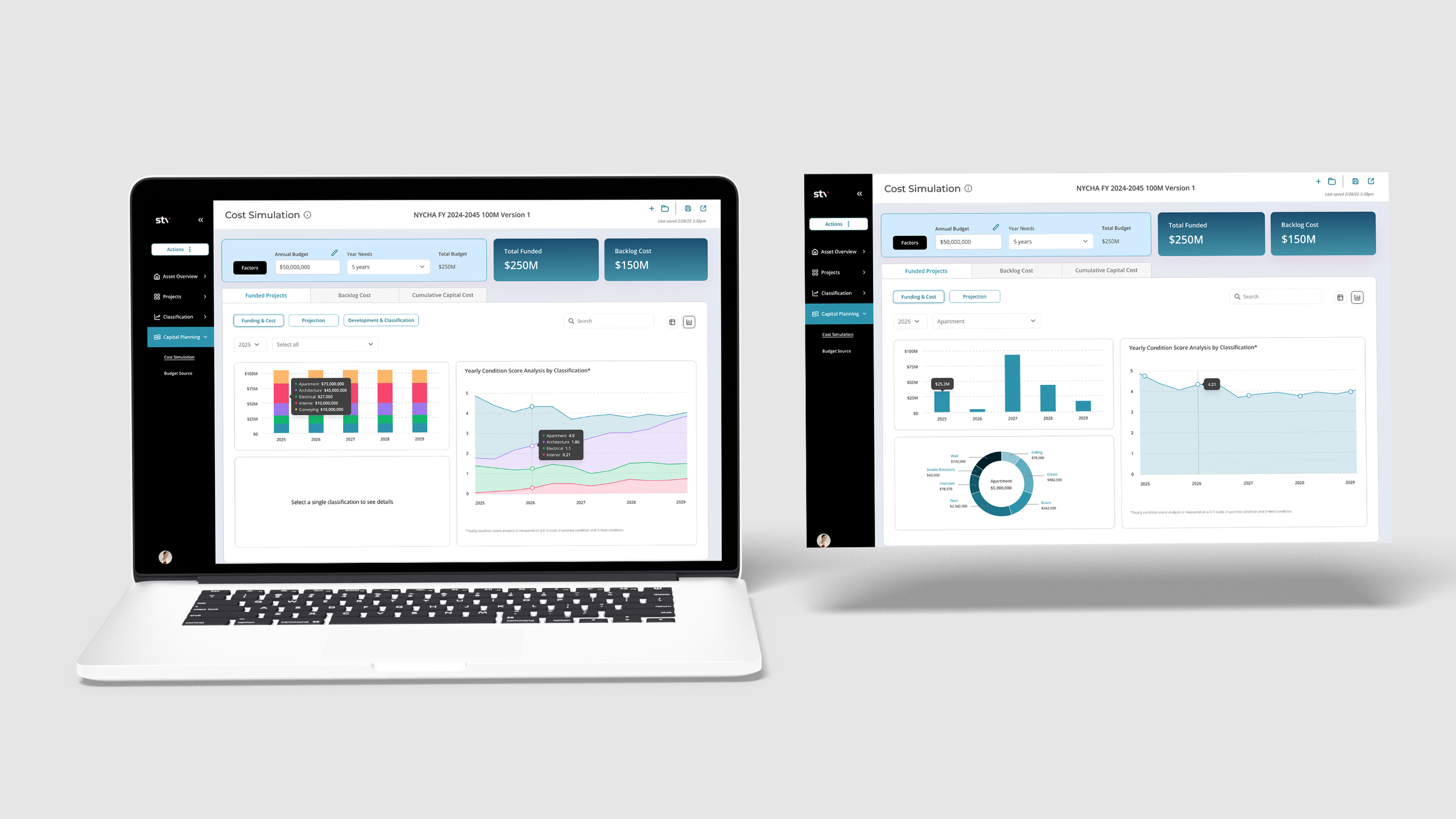
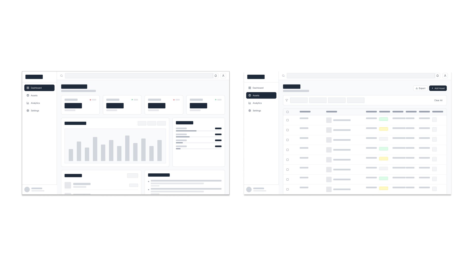
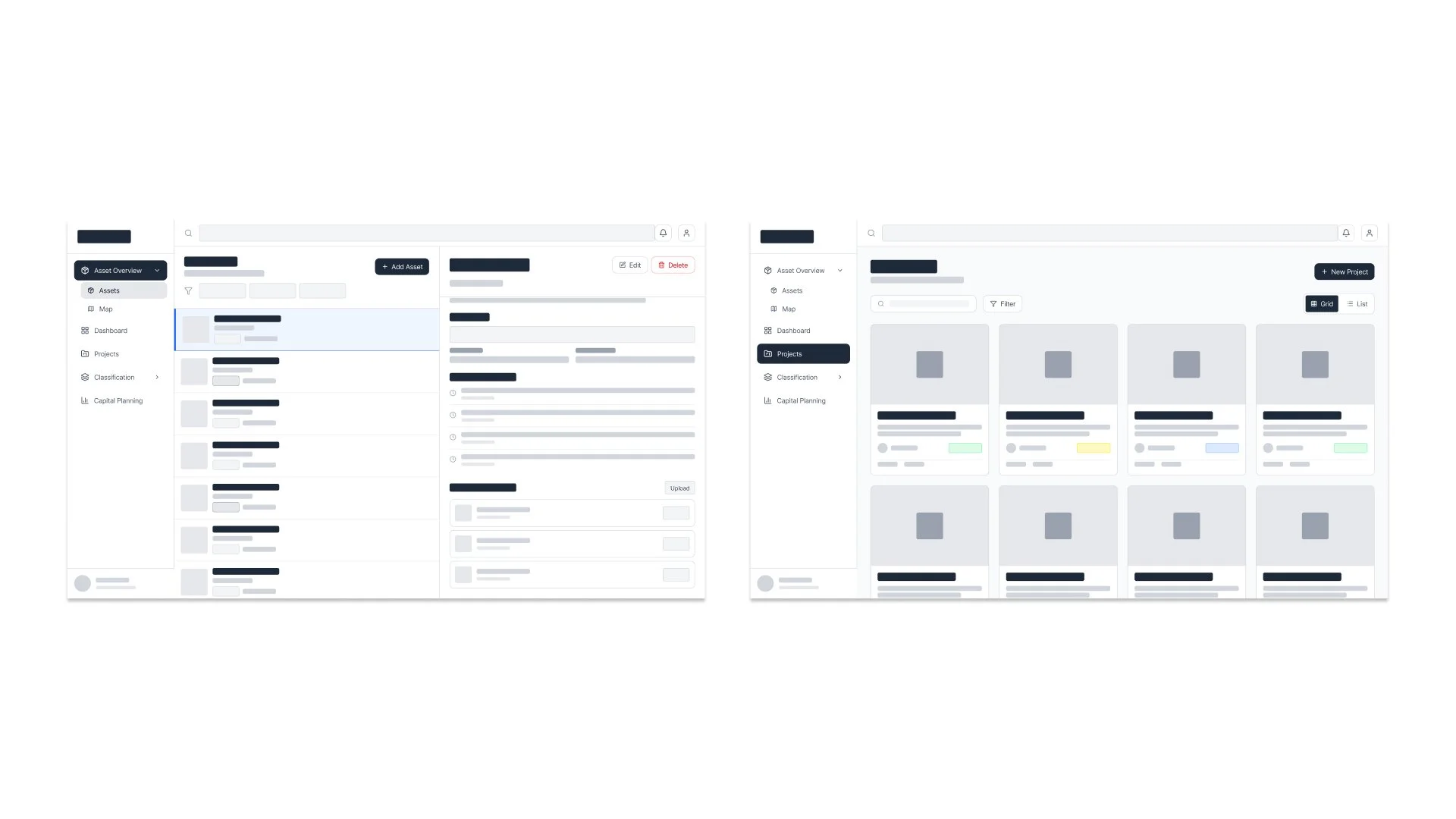
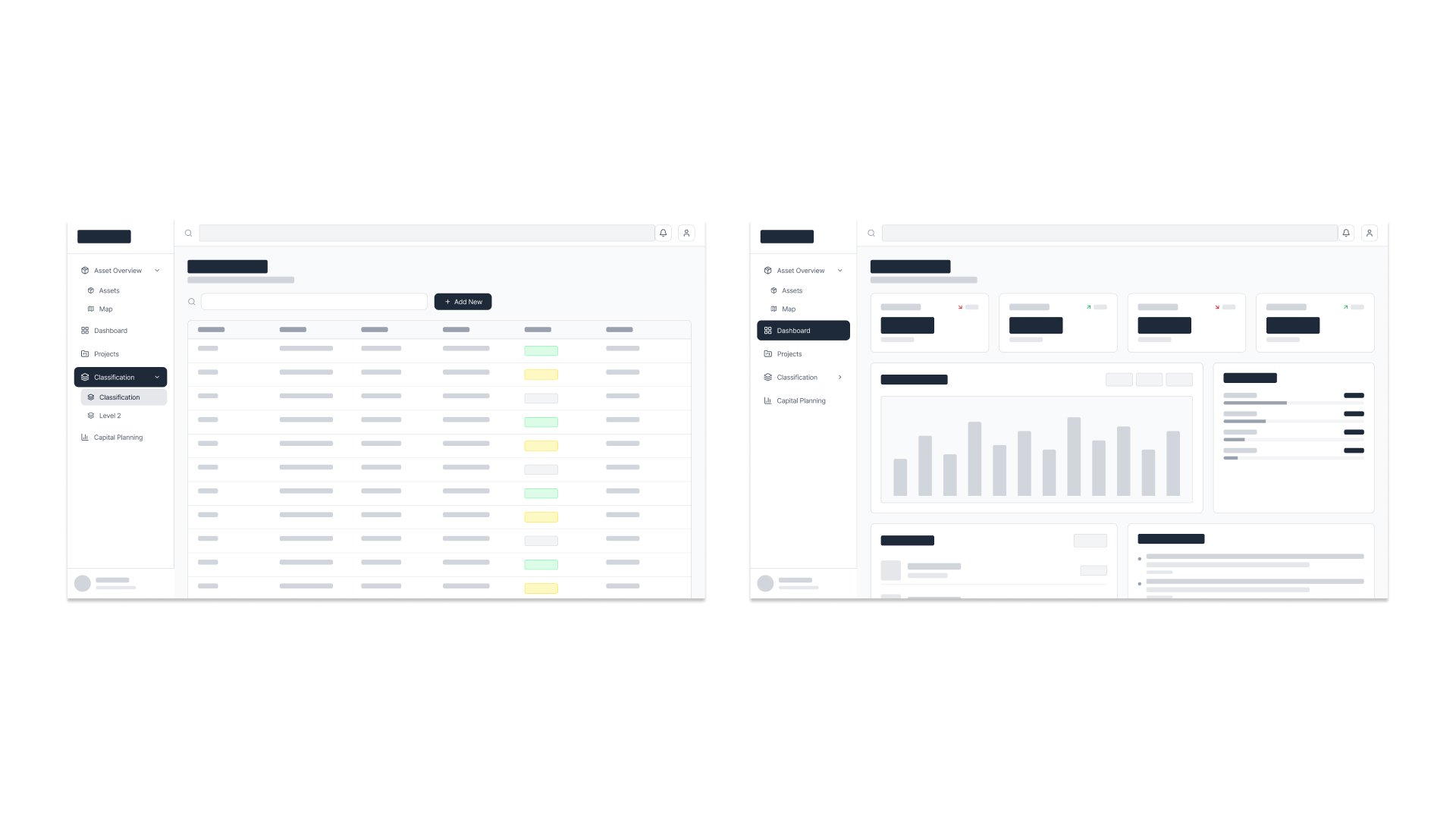
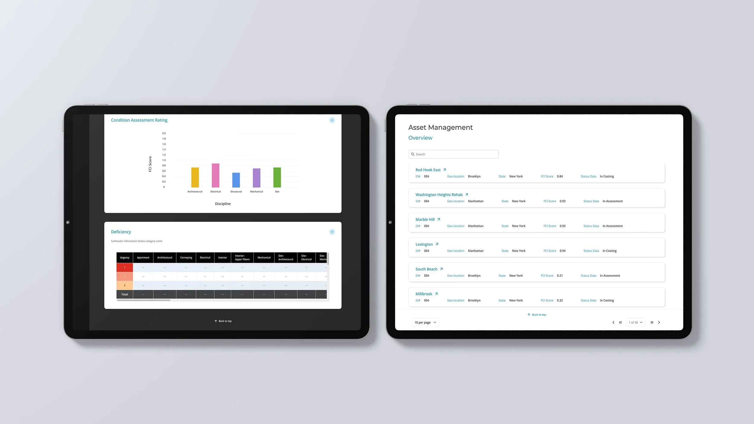
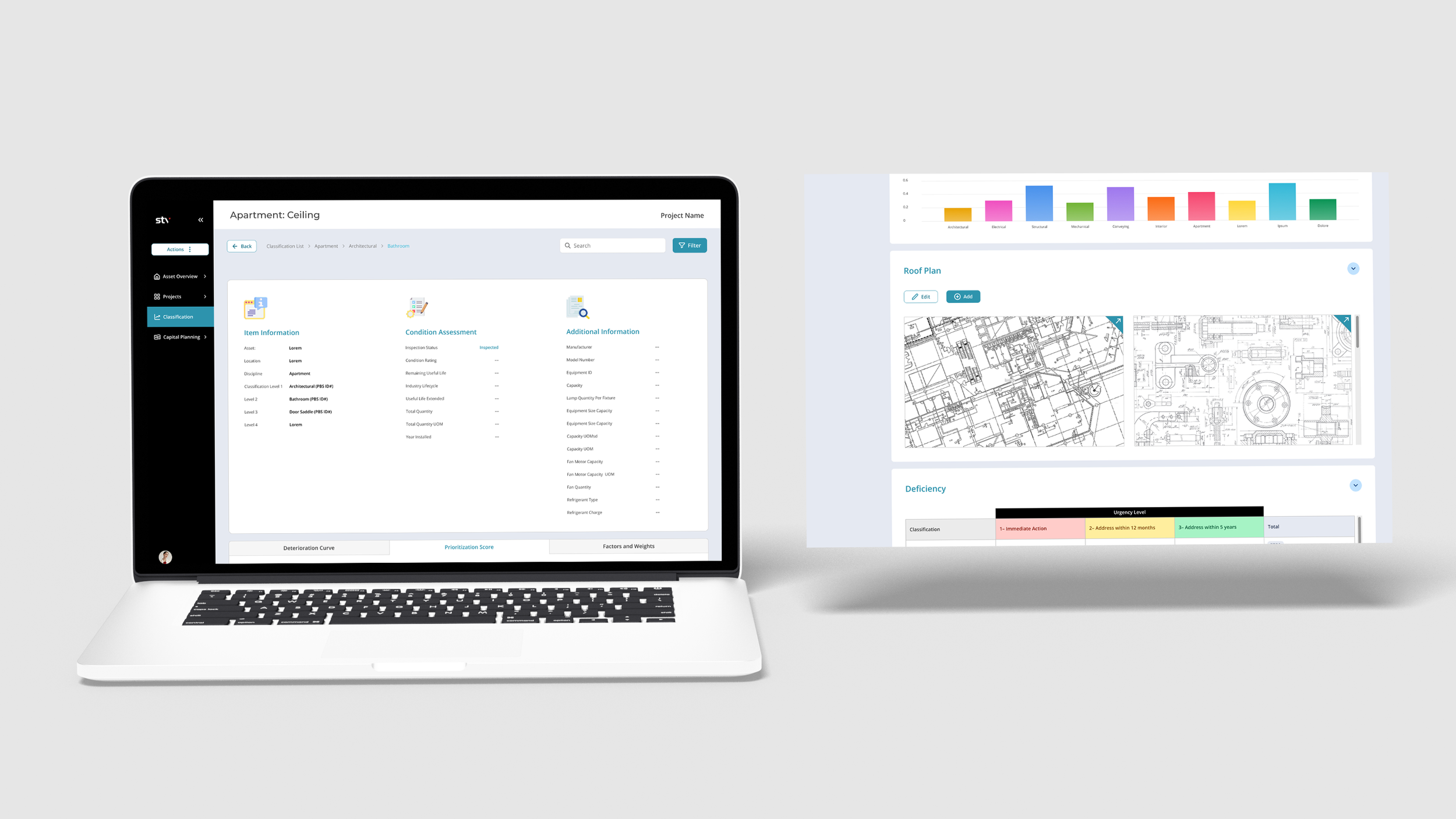
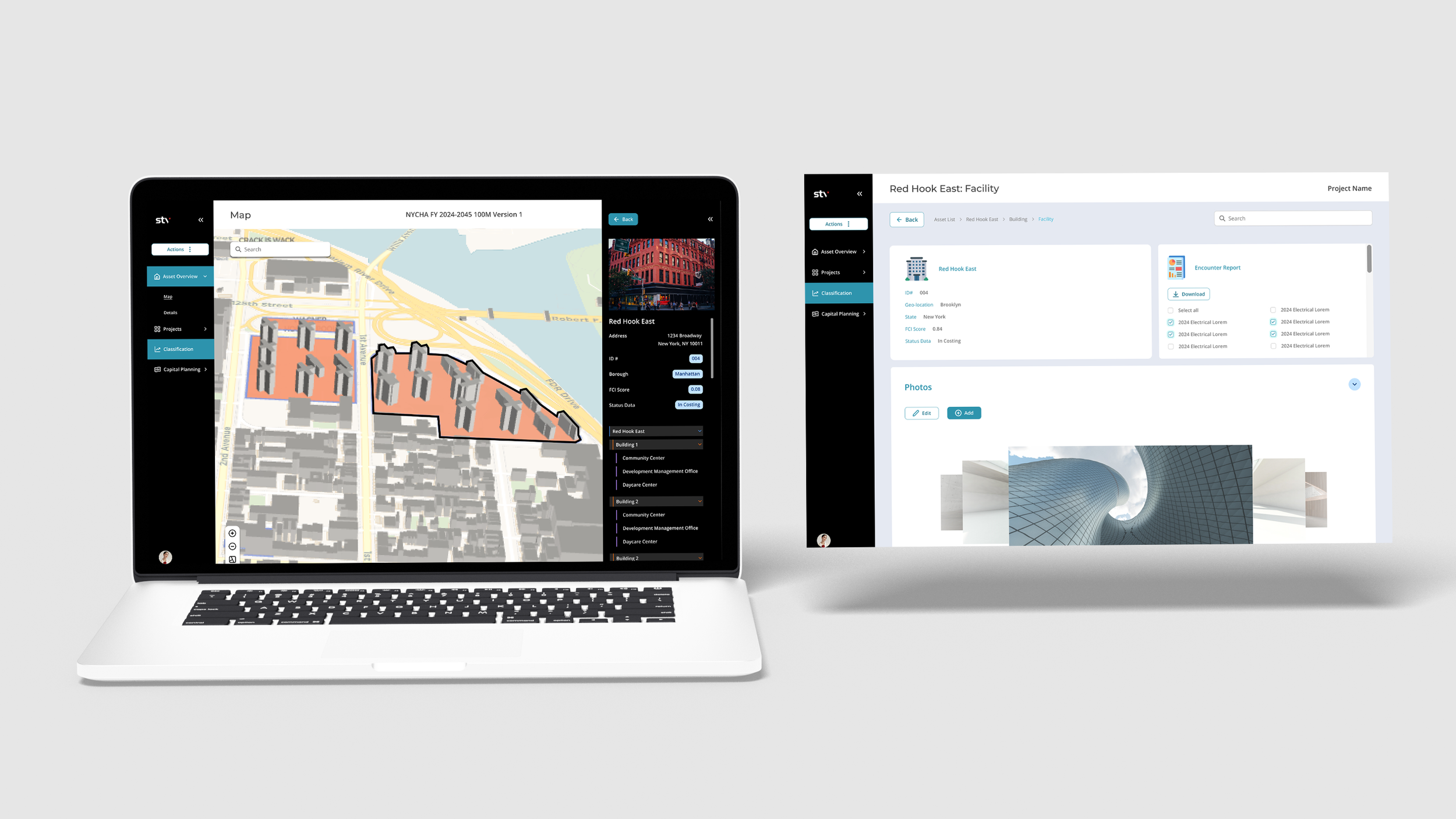
Designed a modular dashboard system that surfaces key metrics, supports multi-year forecasting, and simplifies asset tracking through clear hierarchy and intuitive data visualization.
Process
Research
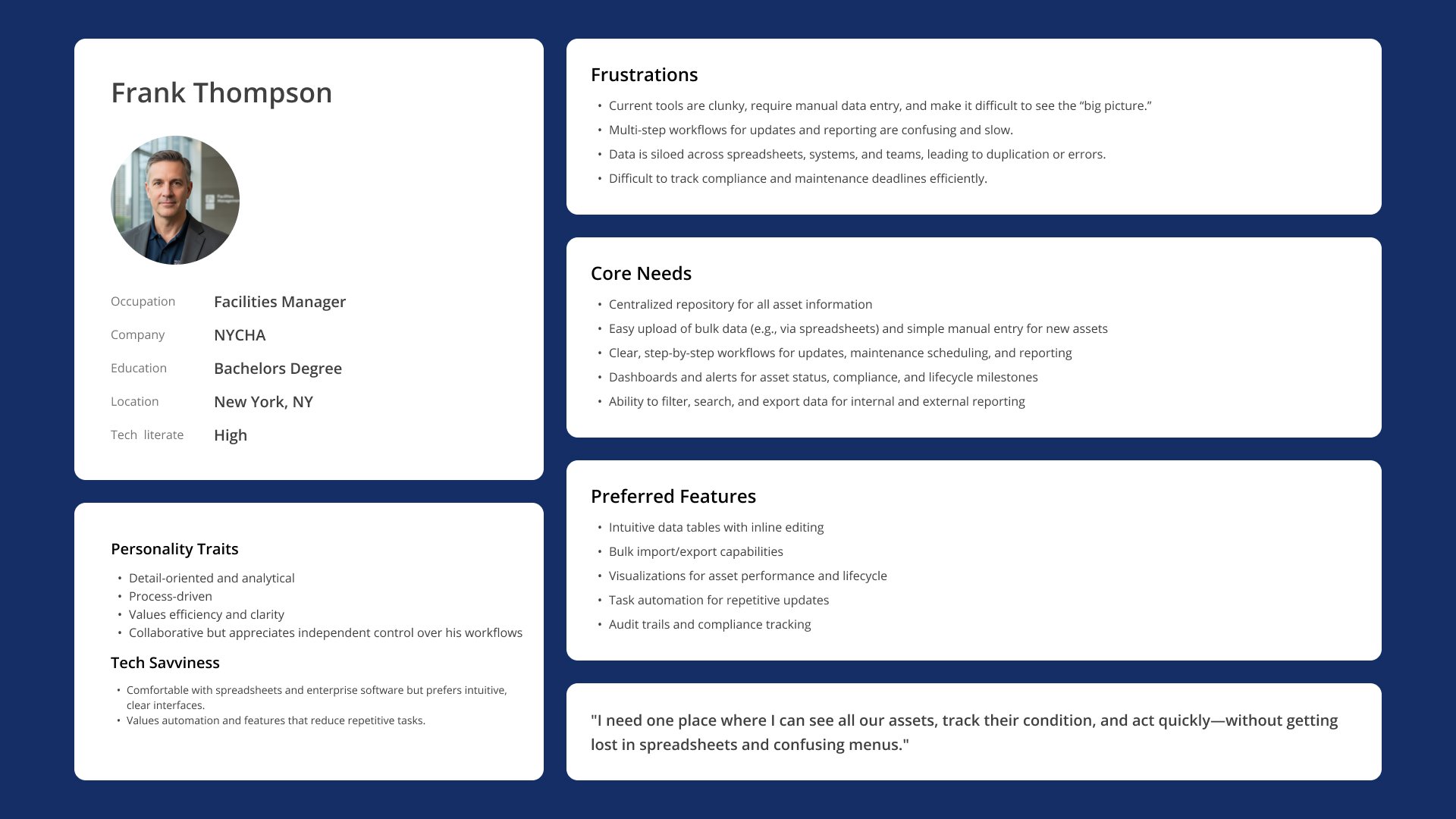
Conducted research through stakeholder insights and competitor analysis to understand existing solutions and gaps, then synthesized findings into personas to guide design decisions and align the product with user needs.
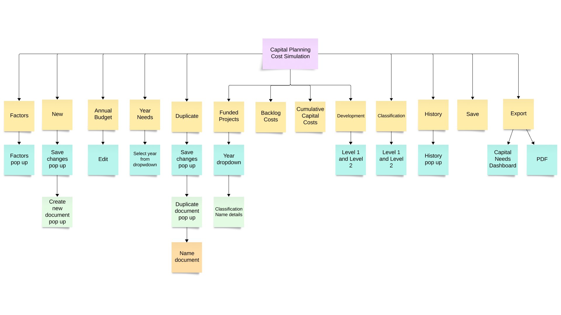
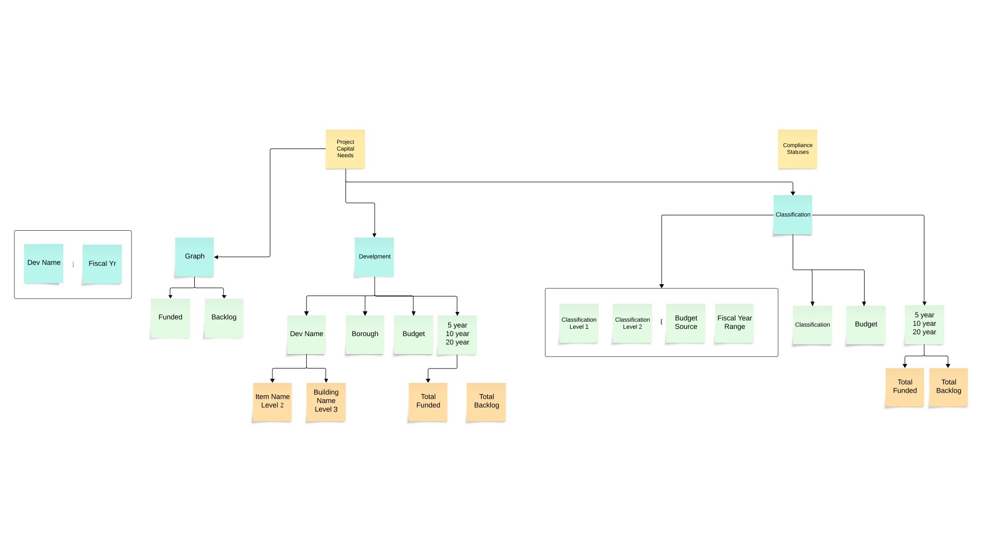
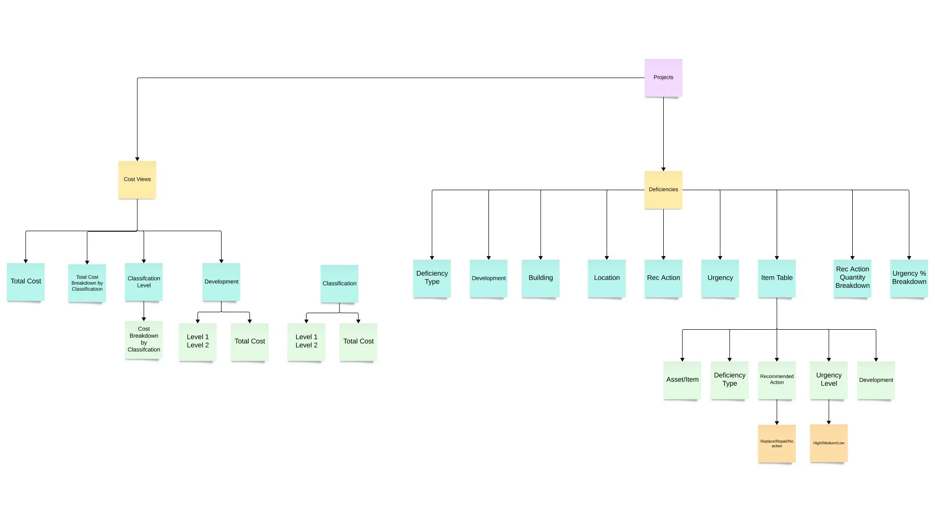
Information Architecture
Structured complex asset data into a scalable system spanning dashboards, inspections, reports, and administrative tools.
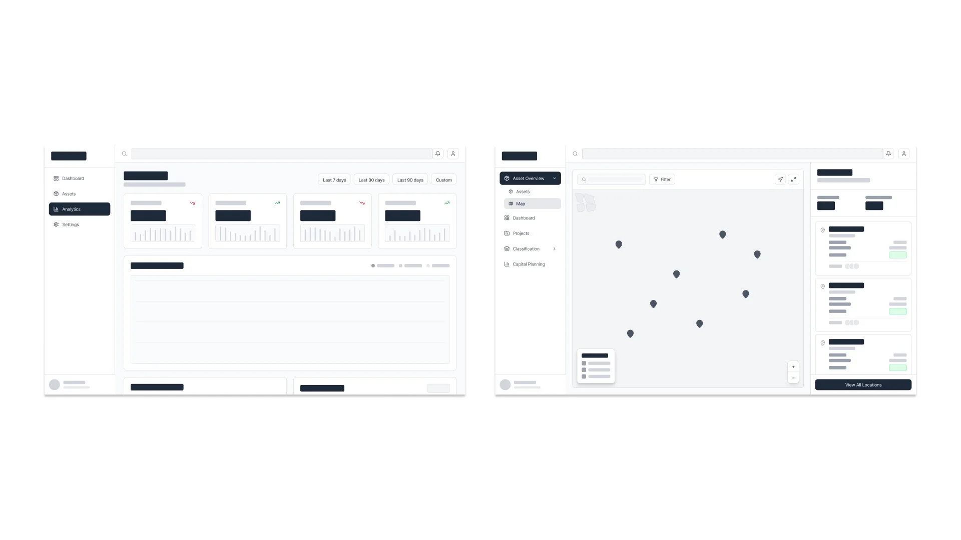
Wireframes, Designing & Prototyping
Explored and iterated on wireframes and prototypes to balance complex data density with clear structure, intuitive navigation, and overall usability.
Key Features
-
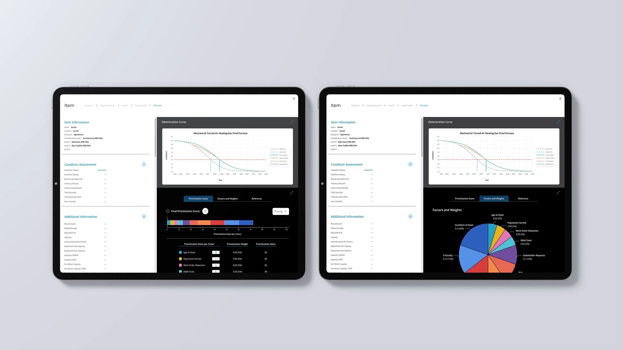
Asset Health & Monitoring
• Condition ratings and lifecycle tracking
• Performance degradation over time -
Data Management
• Centralized asset records and history
• Inspection reports with visual documentation -
Maintenance Planning
• Budget allocation and prioritization
• Lifecycle cost analysis -
Forecasting
• Multi-year budget projections
• Scenario planning for repairs and replacements
Design Evolution
Initial Design
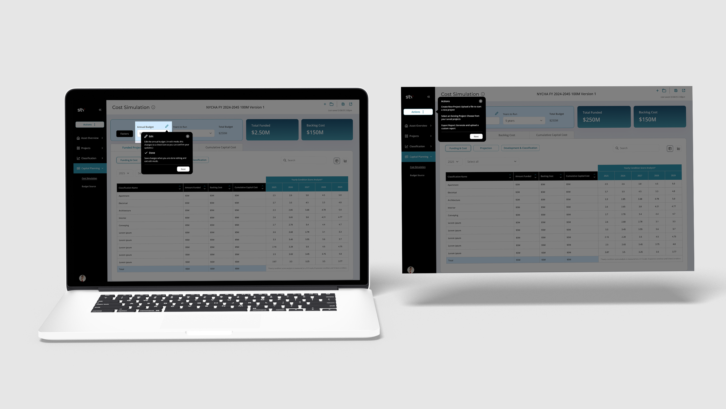
The initial design was functional but required multiple clicks, relied heavily on dense tables, and lacked visual clarity and guidance. It provided the core functionality but created friction for users. The interface was visually dense, navigation required too many steps, and accessibility considerations were limited.
Refined User-Centered Design
Improved usability through clearer hierarchy, reduced steps, better accessibility, and an optional guided walkthrough.
Key UX Challenges
-
Simplifying Complex Data
Designed ways to present large, complex datasets without overwhelming users, focusing on clarity, hierarchy, and ease of understanding.
-
Balancing Flexibility & Clarity
Created dashboards that offer customization and depth while maintaining a clear, intuitive structure.
-
Supporting Long-Term Planning
Enabled multi-year thinking by designing tools that help users visualize and plan for future outcomes over time.
-
Making Data Actionable
Translated technical data into clear, scannable insights to support faster, more informed decision-making.